Ariadne, bunyote friend 
ariadne@treehouse.systems

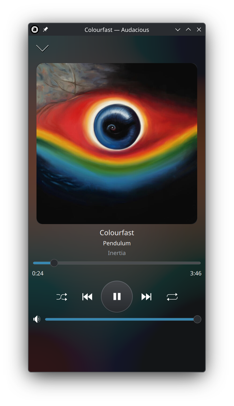
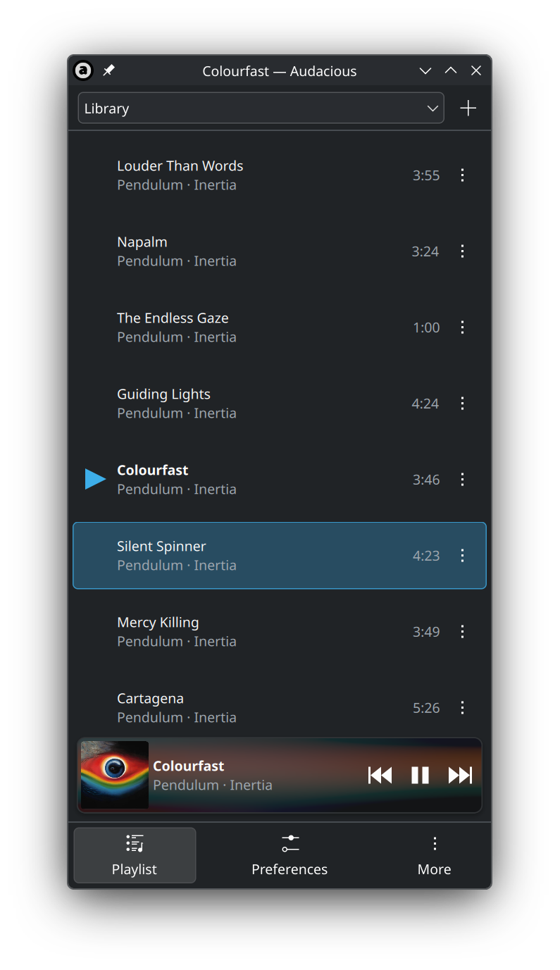
reworked navigation a bit, which allowed me to get rid of that ugly hamburger menu stuff
 3
3
 0
0
 0
0
Ariadne, bunyote friend
ariadne@treehouse.systems
@whynothugo it is the audacious kirigami UI
https://github.com/audacious-media-player/audacious-plugins/pull/214
1
0
0
Hugo 雨果
whynothugo@fosstodon.org@ariadne Looks pretty nice, and audacious is really pleasant to use on the desktop. How do you add files to queue on a mobile interface?
1
0
0
Bruno Miguel
brunomiguel@masto.pt
@ariadne looks pretty cool. Will you make an apk available at some point?
1
0
0
Ariadne, bunyote friend
ariadne@treehouse.systems
@brunomiguel it is not for android at this time
1
0
0

f_ 🇵🇸
fun(apk happens to be the name of the package manager used by alpine and postmarketOS, predates Android's apk :)
1
0
0
Ariadne, bunyote friend
ariadne@treehouse.systems
@brunomiguel @fun yes, it will be in the next release :p
0
0
1
Ariadne, bunyote friend
ariadne@treehouse.systems
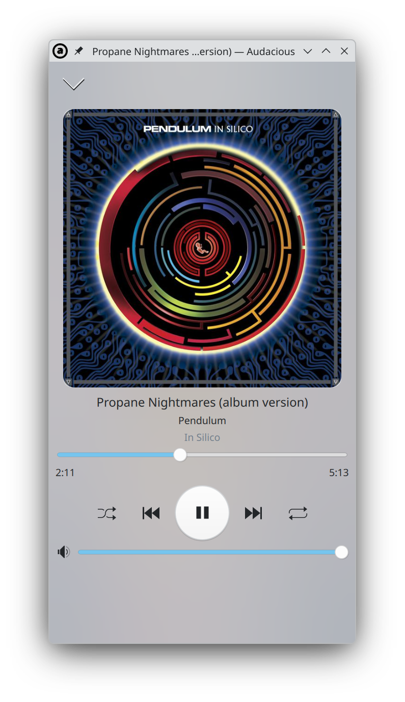
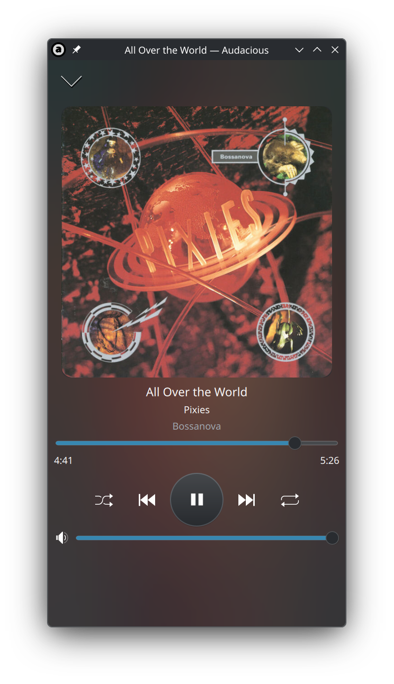
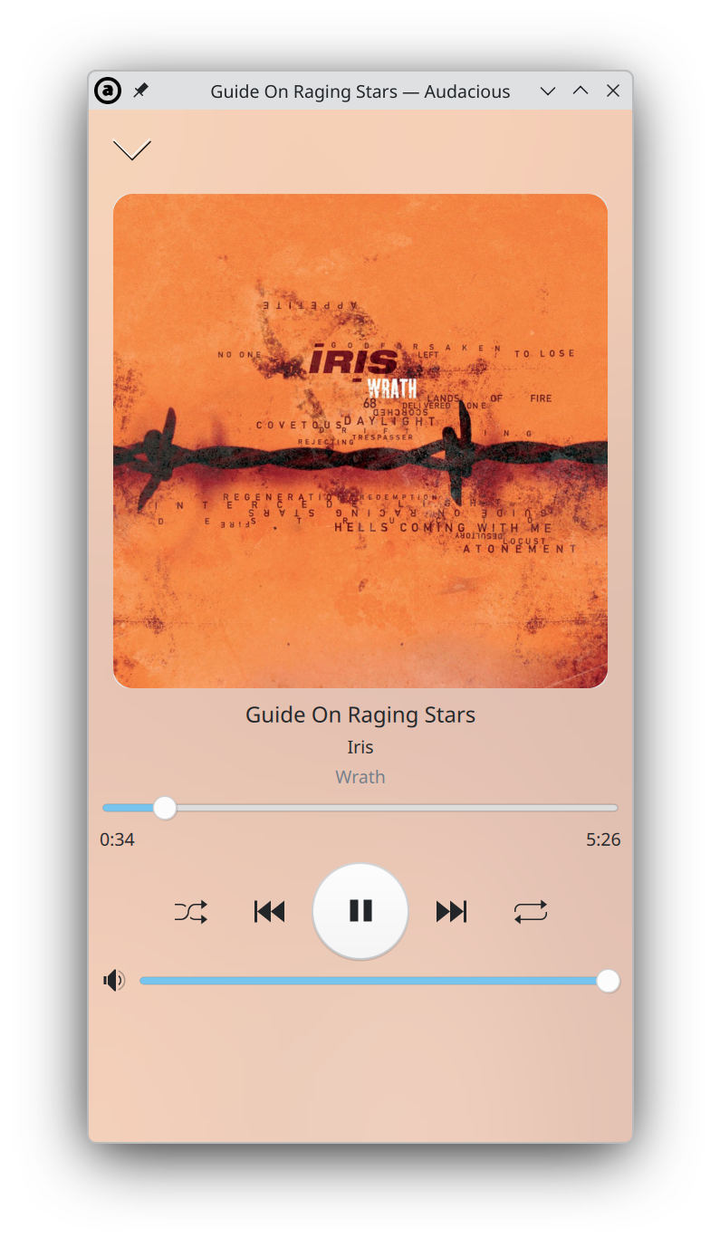
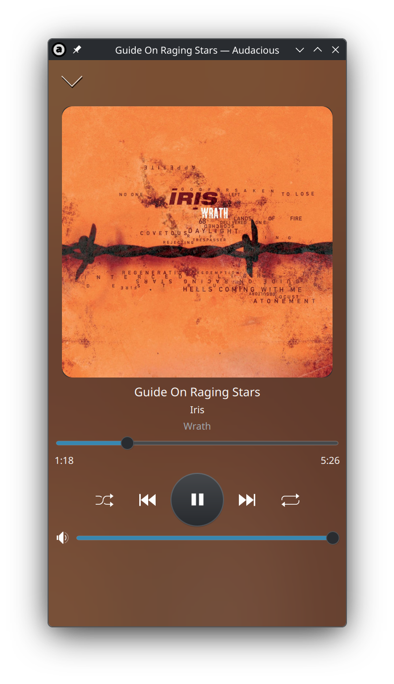
in light mode, the blurhash effect is not as intense as it could be. time to play with the CSS.
 2
0
0
2
0
0
Ariadne, bunyote friend
ariadne@treehouse.systems
@fun should be fine. it is a very basic gradient + opacity effect.
1
0
0
Ariadne, bunyote friend
ariadne@treehouse.systems
@fun (it is not blurring at all, but rather sampling chroma and luminance on a 16 point grid and generating a gradient from it)
1
0
0

k, cis iirc
kouhai@treehouse.systems@ariadne I wonder if there’s point in an intensity selector (off/low/high)
1
0
0
Ariadne, bunyote friend
ariadne@treehouse.systems
@kouhai i think it is better to let the theme select the intensity
1
0
0

Ariadne, bunyote friend
ariadne@treehouse.systems
@kirakira no, my media player is old enough to drink in the US. i am just making a new interface plugin for pmOS phones.
0
0
0
Ariadne, bunyote friend
ariadne@treehouse.systems
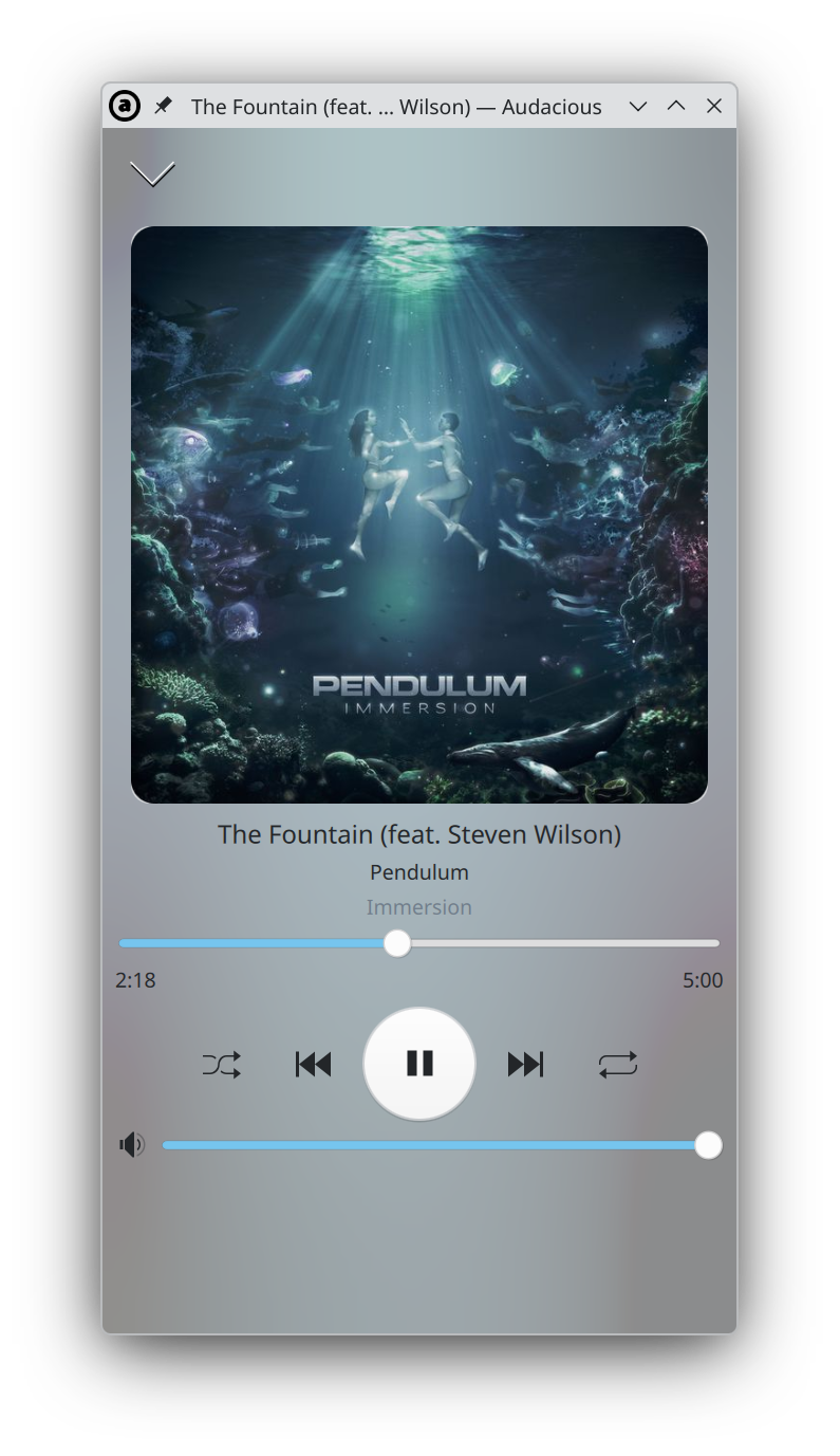
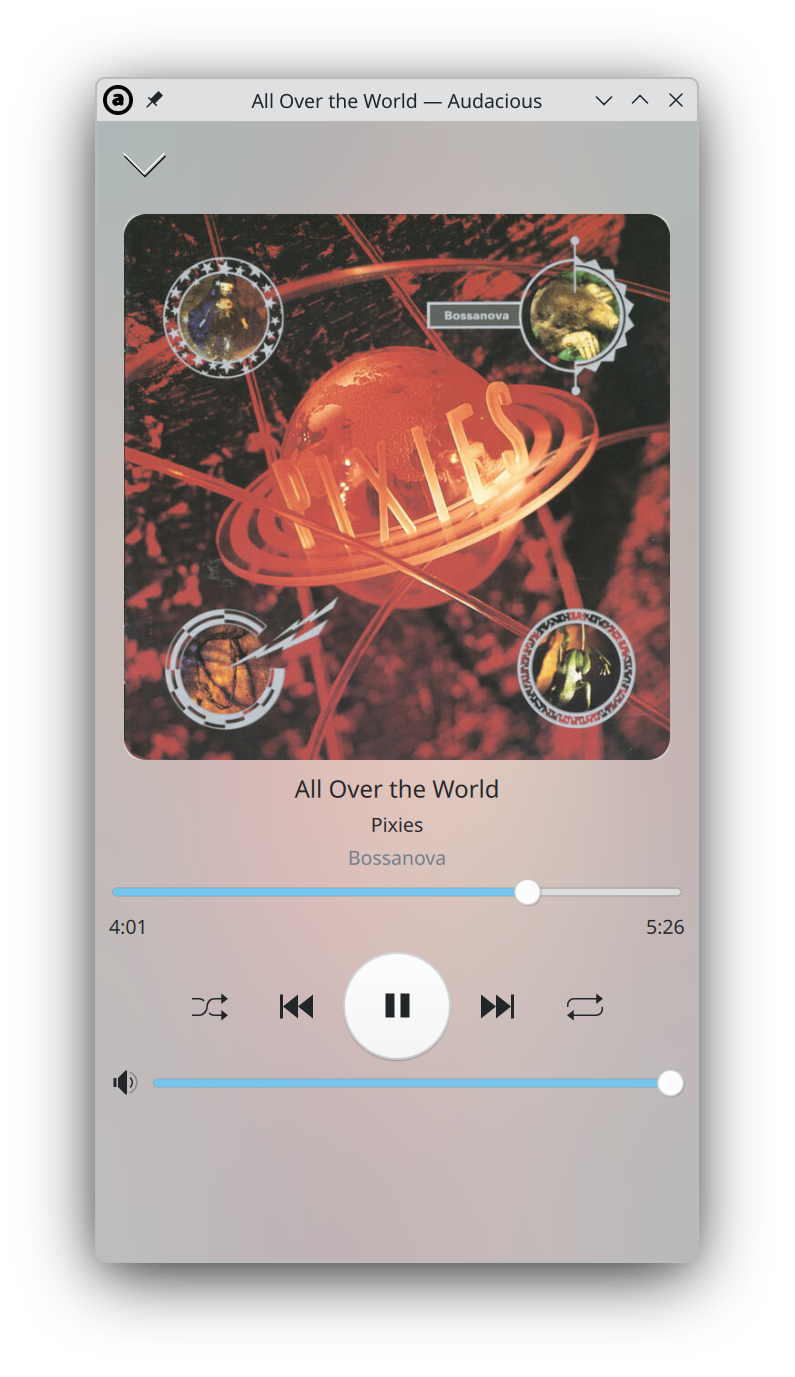
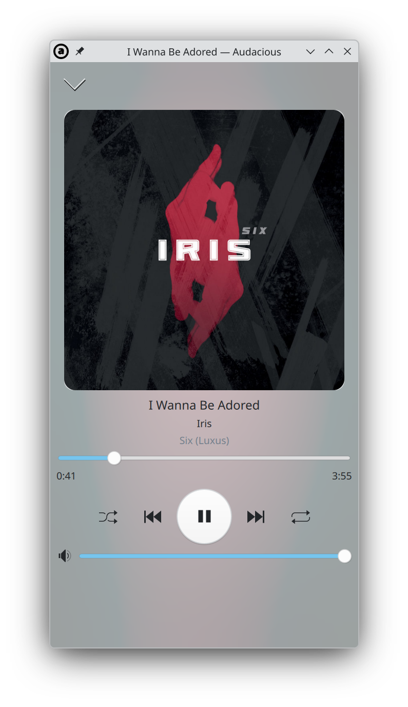
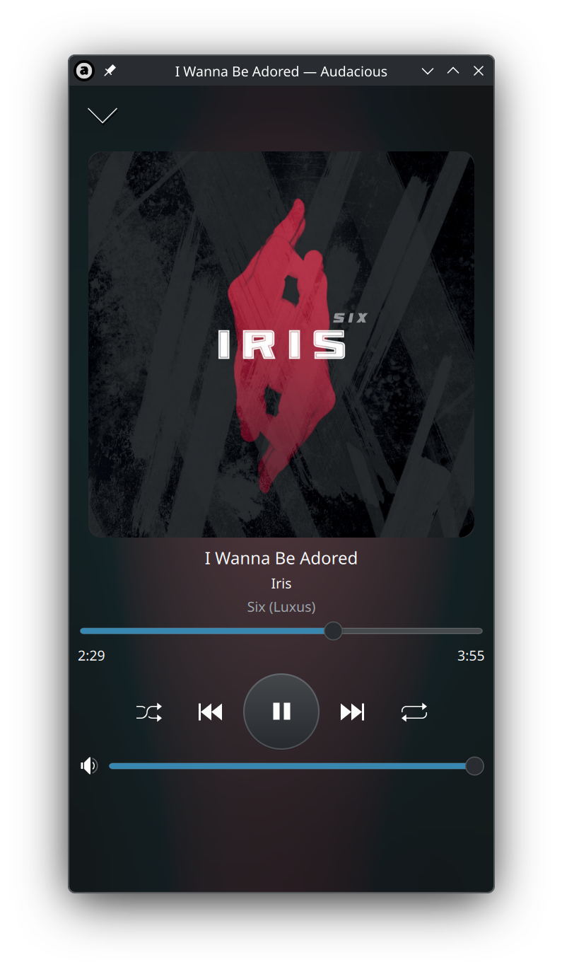
yet another light mode vs. dark mode comparison, i think i've nailed the light mode side so i'm going to go back to focusing on core functionality.
 3
0
0
3
0
0
Ariadne, bunyote friend
ariadne@treehouse.systems
and yes, i am of the opinion the dark mode looks better. but i prefer dark mode in general.
3
0
0
Brandon
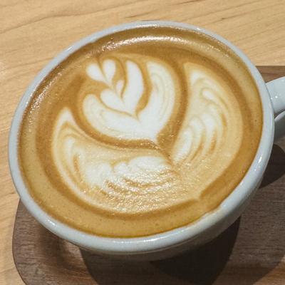
be_far@treehouse.systems@ariadne the beloved sequel to Liquid Glass: brushed aluminum
1
0
0
Ariadne, bunyote friend
ariadne@treehouse.systems
@be_far in a way what i am trying to approximate is the projection of scattered light onto material, so...
0
0
0
Ariadne, bunyote friend
ariadne@treehouse.systems
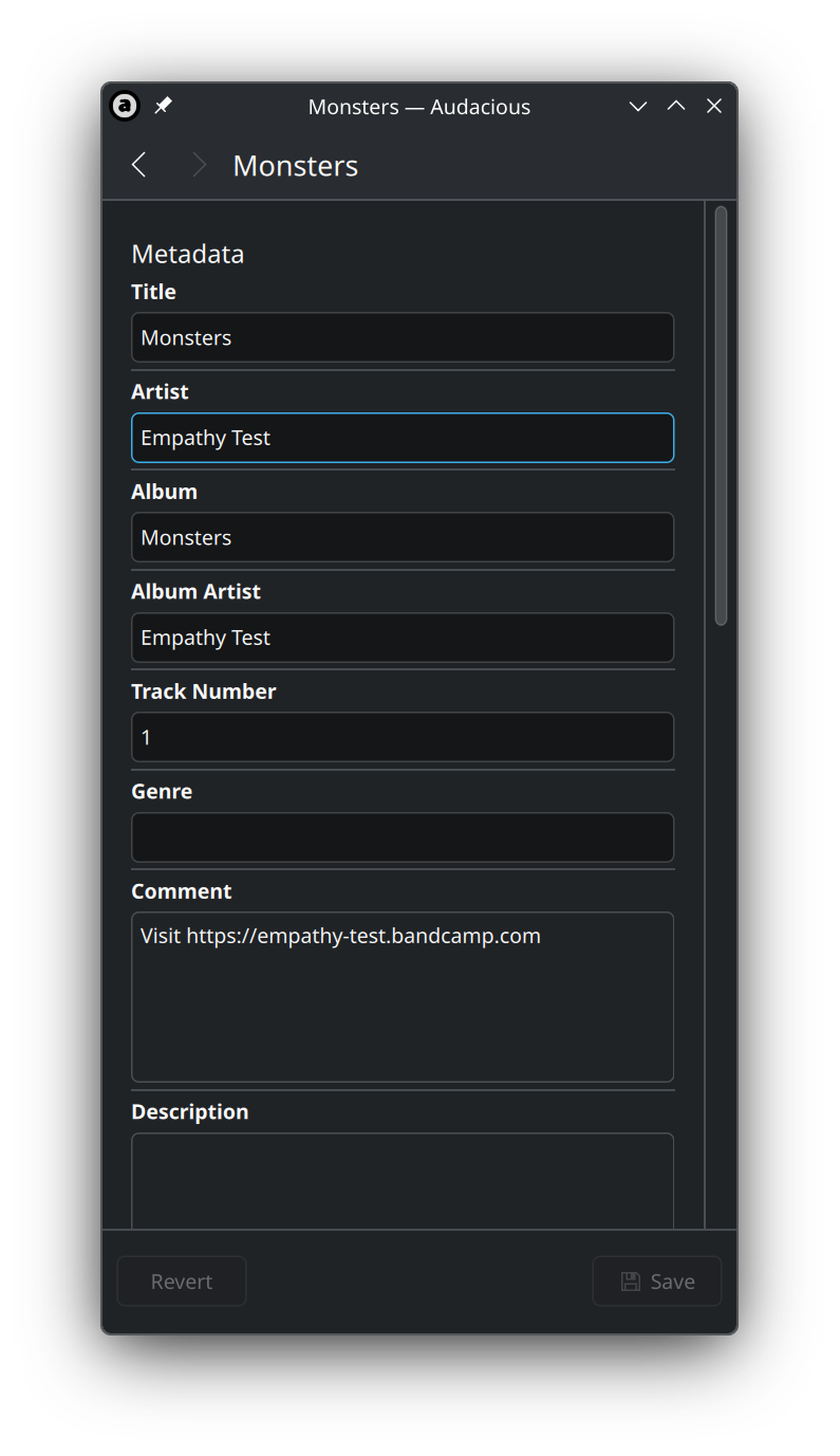
well, this isn't the worst, but it isn't that great either. i'll give it some love later.
 2
0
0
2
0
0
gaytabase
dysfun@treehouse.systems@ariadne a bit of vertical margin between elements would go a long way
1
0
0
Ariadne, bunyote friend
ariadne@treehouse.systems
@dysfun yeah i basically wrote a script to autogenerate this qml file lmao
0
0
0
Tris
tris@chaos.social@ariadne wow, nice! I have been using https://flathub.org/en/apps/app.drey.EarTag for this
1
0
0
Ariadne, bunyote friend
ariadne@treehouse.systems
@tris hell yeah @undefined is one of the coolest people i know
0
0
0


its nice. you did a good job. thank you, im really used to the light mode variants being rather half-assed
1
0
0
Ariadne, bunyote friend
ariadne@treehouse.systems
@coolbean i figure somebody should care about quality in an era of slop
0
0
0
Piranhallama
securedllama@infosec.exchange@ariadne that's one of the first light mode things I've liked. Looks gorgeous.
0
2
0